Traffic & Revenue Insights App — Built on a Figma Community Design System
Client
InsideX
Year
2024
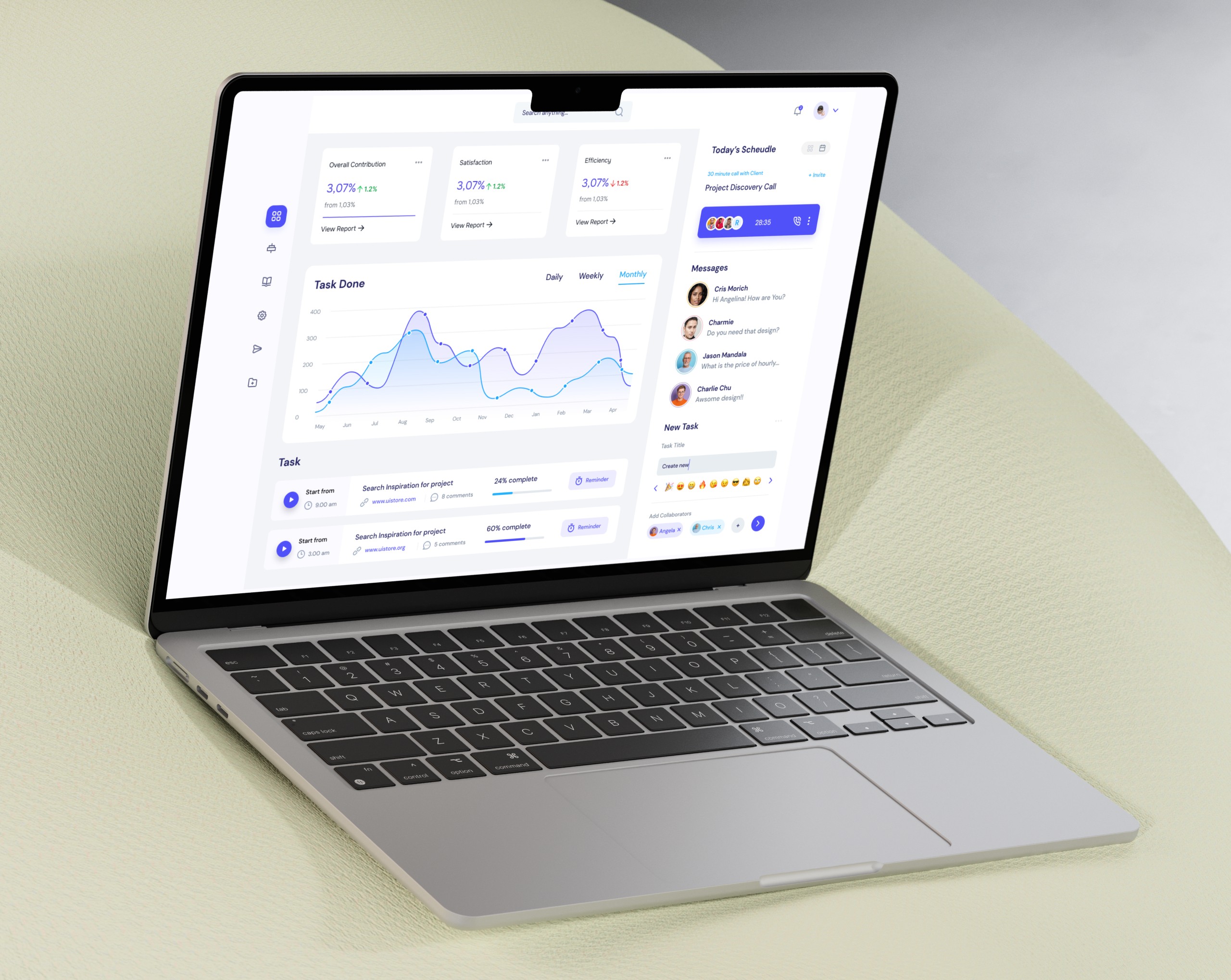
Insidex OS isn’t just another analytics dashboard — it’s a centralized workspace built for internal startup teams. The product combines revenue tracking, order management, task planning, calendar scheduling, team messaging, and customer data into a single platform. I designed the end-to-end interface and component system, working across UX flows and UI design to help early-stage teams operate with clarity. The challenge was to blend utility and data visualization without overwhelming users — especially when they’re jumping between metrics, tasks, and messages daily.
Scope of Work

From Performance Monitor to Operational Hub
This wasn’t a classic dashboard showing vanity metrics. I reimagined the interface as a startup’s operational HQ — a space where team leads, marketers, and ops folks could track revenue, check tasks, and message teammates all in one place. The core question I asked: What if one dashboard could replace five tools?
→ Tooltip: I studied SaaS workflows from Asana, Linear, and Mixpanel to merge utility + analytics into one cohesive layout.

Revenue, Orders, Sessions — All Tied to Context
Each card and chart was placed not just for visual appeal, but for flow. Revenue numbers open the story. Sessions and conversions follow. Then, orders. This sequence mirrors how founders think: top-line growth → user behavior → delivery outcomes.
→ Visual choices: I used visual contrast and line graphs with date snapshots to anchor trends around action points (e.g., marketing campaigns).

A Modular UI That Feels Custom
While every module looks purpose-built, they all come from the same atomic design system. I built out base components (e.g., status tags, data cards, avatars, and list tables) that snap together across the interface — from Kanban boards to analytics widgets.
→ Tooltip: The card structure follows a 12-column layout with padding variants to ensure consistency across dense and sparse content.

Calendar Meets Kanban, Seamlessly
Operations teams need both time- and task-based planning. I designed a full-year calendar that works in dark mode with clear interaction states, paired with a structured Kanban board that mirrors product development stages.
→ Interaction logic: Task cards use icon tagging and subtle hover states to show ownership and status without expanding content.

Bringing Team Chat Into the Workflow
The messaging module isn’t Slack — it’s focused communication linked to work. I intentionally minimized visual noise, used neutral spacing, and enabled file previews for faster project discussions.
→ Insight: The simplified message UI increases focus. One tester said: “It feels like messaging within a product, not a separate app.”