A task management solution built for cross-functional clarity: Built on a Figma Design System
Client
MNG.IT
Year
2025
MNGIT V2 is a full-featured team workspace tailored to creative professionals and development squads. The product combines messaging, project planning, data reporting, file management, and documentation into one calm, collaborative interface. I designed every screen with the goal of reducing context-switching across teams — blending conversations, timelines, and work output into a single space. This project helped me practice restraint in UI while solving for real-world productivity scenarios: scattered tools, unclear timelines, and misaligned feedback loops.
Scope of Work
A Timeline That Shows the Why, Not Just the When
The timeline wasn’t just for managers to track deadlines — it was for cross-functional teams to visually understand what’s next. I grouped work by phase (research, design, development), color-coded them by function, and added inline progress indicators. I wanted team members to feel informed, not overwhelmed.
→ Design decision: I reduced visual weight on vertical dividers and made each task pill interactive on hover without requiring clicks.
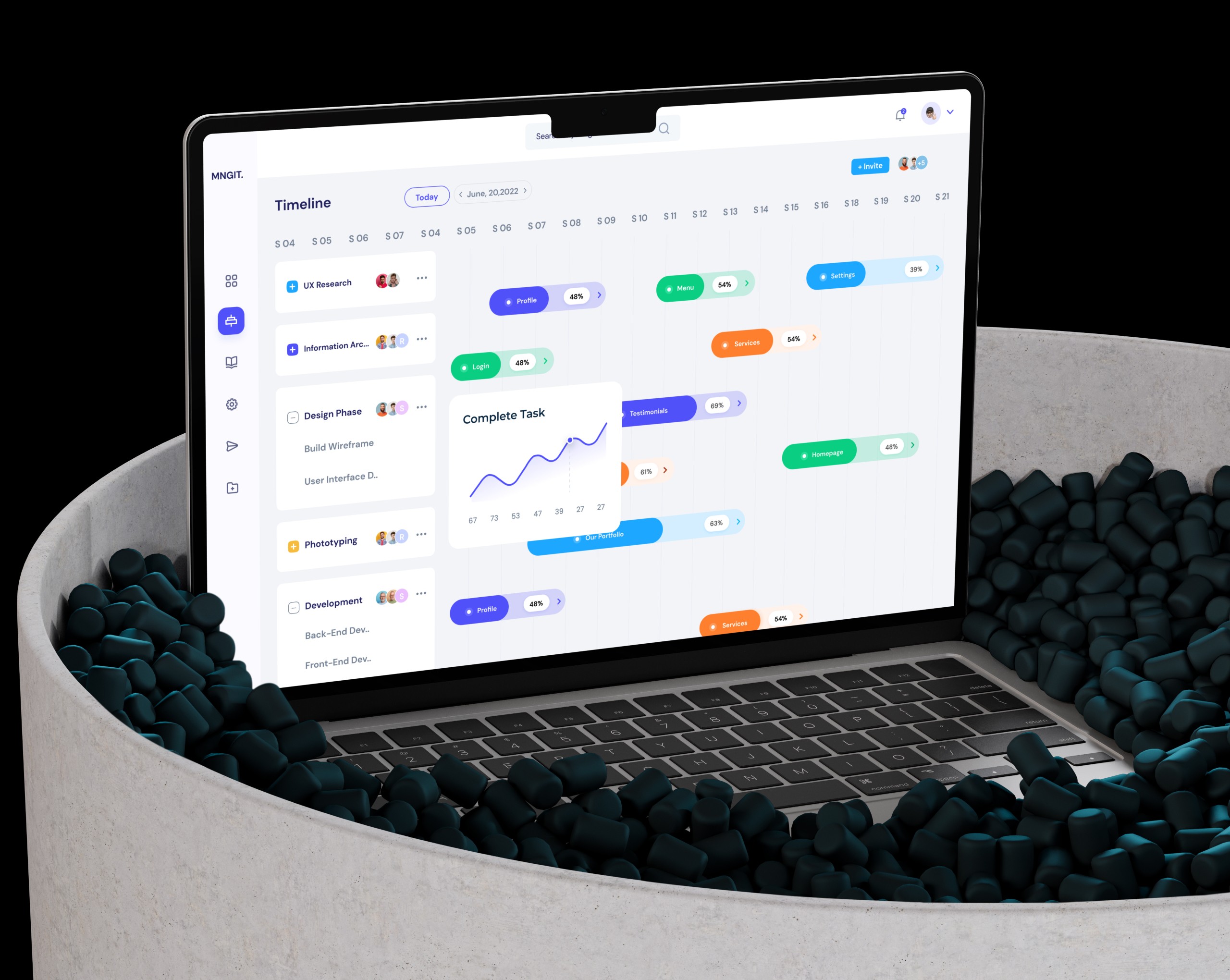
Visual Task Boards with Built-In Group Awareness
Each card contains task context, timeline, status, and contributor insights. I introduced status tags with color-coded categories (research, design, content) and placed avatars visibly on top of each card. To support group transparency, I embedded a real-time group chat within the board view.
→ Tooltip: The board follows a 4-column workflow (Backlog → To Do → In Progress → Review) that maps to modern product development sprints.
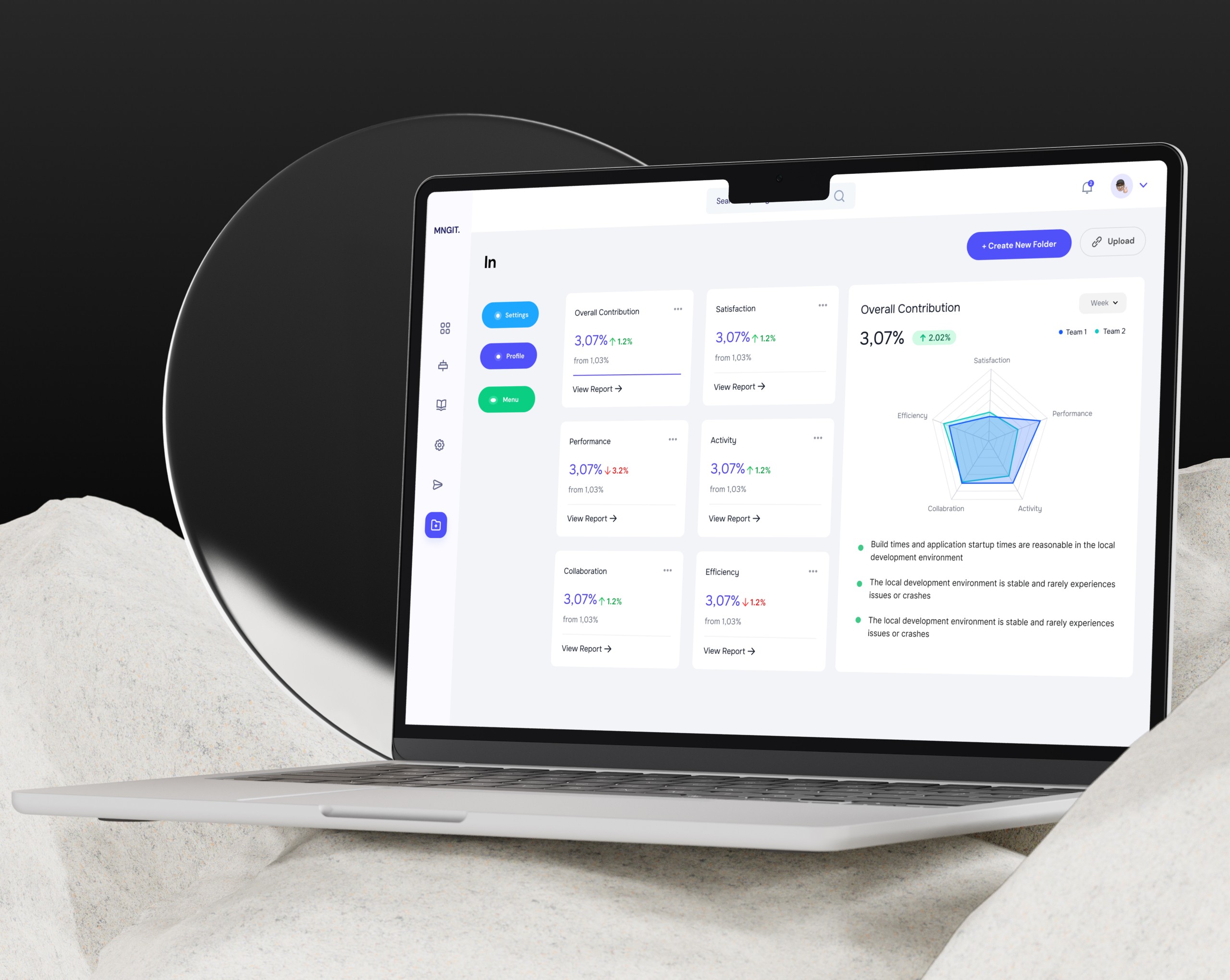
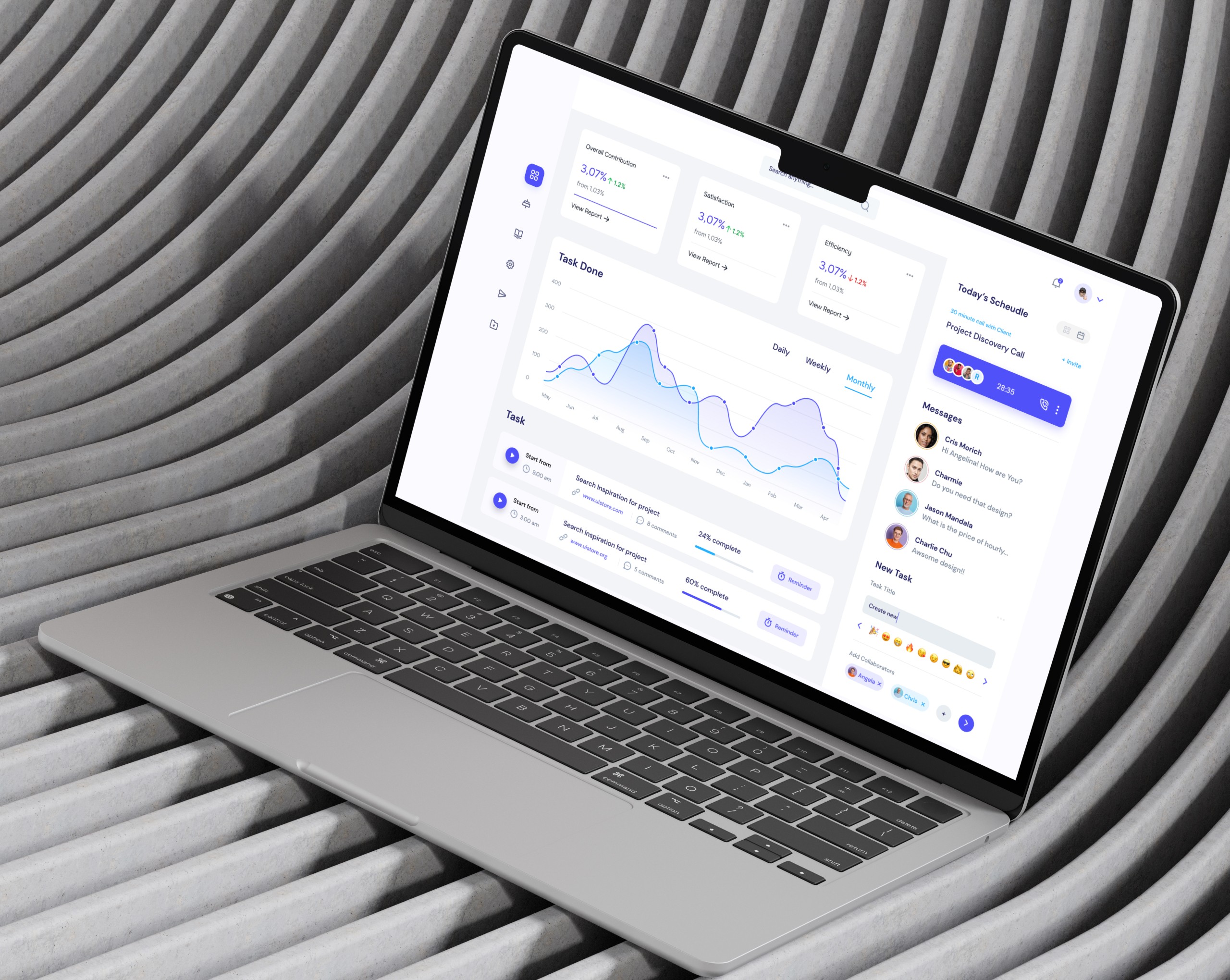
Making Team Progress Understandable at a Glance
Instead of separating reports into a different tool, I designed a compact, in-app analytics view that shows collaboration, efficiency, and contribution in real-time. The spider chart gives a team-vs-team comparison, while the metric cards offer direct feedback loops on group activity.
→ Visual rationale: Reused the same layout grid as the Kanban to keep spatial memory intact across interfaces.
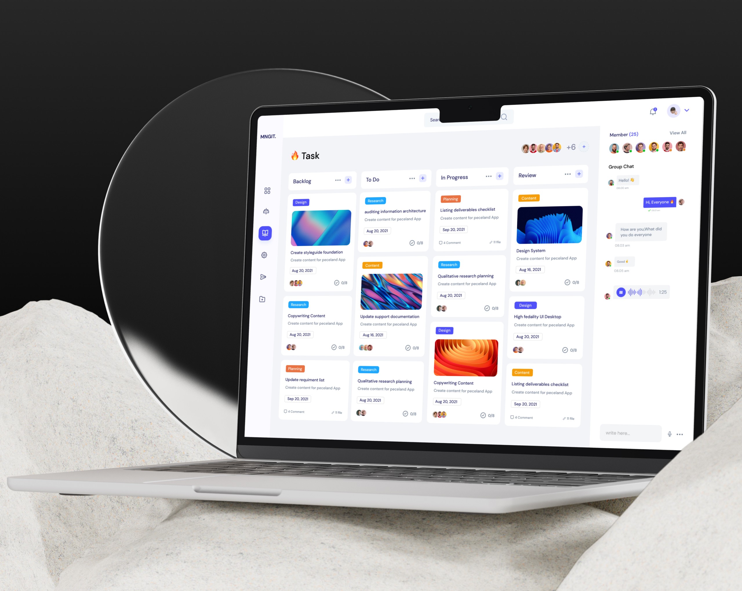
Keeping Communication Where Work Happens
I designed a messaging interface that focuses on task-linked conversations, not general chat. The layout supports threaded replies, direct file attachments, and a clean split between group and individual views — so the UI scales with team complexity.
→ Insight: All message threads were paired with an activity log and user file sidebar to avoid hopping between screens.
The Art of Building Calm into Collaboration
This project pushed me to think beyond clean UI — I had to solve for communication friction, unclear timelines, and scattered assets. If I revisited it, I’d prototype even more async collaboration features, such as inline task summaries inside message threads.
→ Outcome: Team testers felt they “spent less time switching tabs” and called the file manager + task chat combo “surprisingly smooth.”