AI-powered analytics SaaS
Client
Portal (Confidential)
Year
2025
A product that lets teams connect data, define trusted metrics, and turn insights into shareable reports with AI reducing setup and analysis time without sacrificing correctness.
My role
Product Manager: discovery, prioritization, specs & acceptance criteria, delivery coordination, launch readiness, and measurement.
Scope of Work

Self-serve analytics products fail for predictable reasons:
“Wrong numbers” kills trust. If one metric definition changes between teams, adoption stops.
Setup is where users churn. The moment credentials fail, schema is confusing, or the first query errors out, teams bounce.
People can’t repeat analysis. Without a shared metric layer and report templates, every dashboard becomes “one-off.”
Sharing becomes messy. Reports get screenshotted into Slack because permissions, freshness, and ownership aren’t clear.
AI adds risk. If AI generates metrics or explanations that are inconsistent, users stop believing the whole system.
The product goal wasn’t “charts.” It was trust + repeatability + speed in a workflow used by non-technical teams.

Activation and onboarding
My focus here was removing the real causes of churn:
Made the onboarding flow task-based ( connect a source → define first metric → create first report ), not feature-based.
Instrumented the top setup failures (auth errors, schema mismatch, missing permissions, timeouts).
Added UX + product decisions that reduce support load: clearer error recovery, “what you need from your admin,” and verification steps that prove connection success.
This wasn’t UX polish. It was reducing “setup debt” that blocks adoption.

Integrations
As PM, I treated connectors like a product:
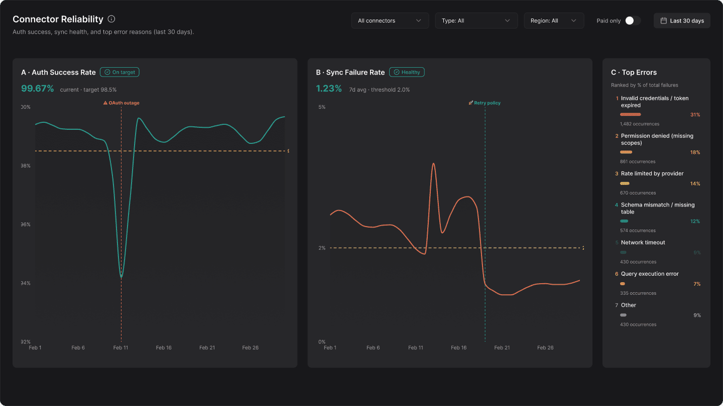
Prioritized connectors based on customer frequency + business impact, not engineer convenience.
Defined what “good” means: auth flow, retries, rate limits, error messaging, and what gets logged for support debugging.
Partnered with engineering on a supportable integration contract: predictable failure states and clear ownership.
Most analytics tools lose users because integrations are fragile. The work here was making connectors reliable enough to trust.

I ran launches like a B2B product should be shipped:
Staged rollout (pilot cohort → wider release) with clear exit criteria.
Release readiness: support enablement, known issues list, internal docs, and rollback strategy for risky changes.
Quality loop: incident review, instrumentation fixes, and “what broke trust” retros.
What I delivered
PRDs + acceptance criteria for onboarding, connectors, metric definitions, and reporting
Measurement plan (activation, time-to-value, retention, trust/quality signals)
Rollout plan + enablement (release notes, internal training, support playbook)
Risk register for AI + integrations + metric correctness

Metric layer (the trust engine)
This is where I invested the most PM attention because it determines whether teams adopt the product:
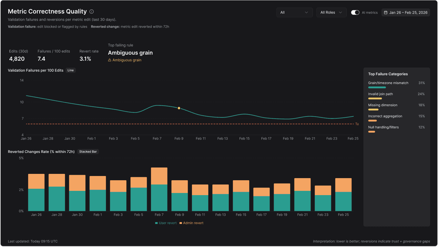
Defined a metric spec standard: name, formula, grain, filters, dimensions, time zone rules, and known caveats.
Introduced validation and guardrails to prevent silent errors (e.g., invalid joins, missing fields, incorrect aggregation).
Managed governance decisions: who can edit metrics, how changes propagate to reports, and how teams can trust “this metric means the same thing everywhere.”
Real world pain this solved: Sales says conversion is 12%, Finance says 9%. The product needed to prevent that argument.

Results (NDA-safe but real)
I measured success through adoption + trust:
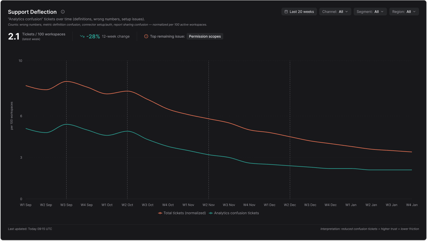
Reduced drop-offs in setup by targeting the top failure points (auth, schema, permissions).
Improved metric trust by standardizing definitions and adding validation/guardrails.
Increased repeat usage by making sharing + targets part of a recurring workflow.