Music App Concept: Personalized Listening with AI, UI Design
Client
Muse
Year
2025
Creating a music app might sound simple, but the real challenge was clear from the start: how do you stand out in a world where everyone listens to music, and countless apps already exist?
When I was looking at the tracks, I got a firsthand look at how many platforms music distributors push content to. And yet, the experience felt identical everywhere. It made me wonder: what kind of value could we add that listeners don’t already have?
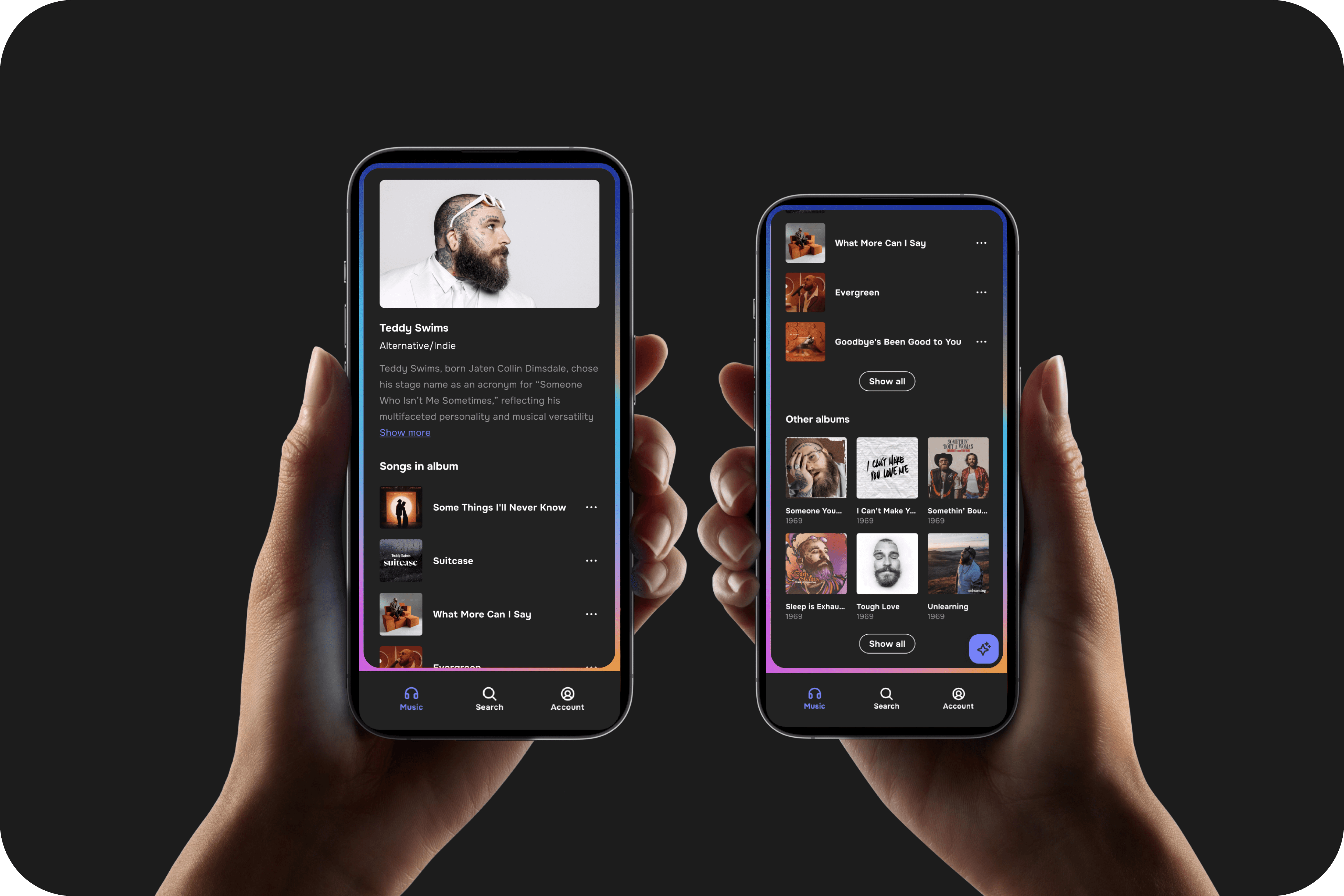
That question shaped the concept for Muse: a mobile app designed to cut through the noise with AI-powered personalization and a clean, distraction-free experience. Instead of forcing users to dig through endless playlists, Muse adapts to their mood, habits, and context to deliver music that fits the moment.
This is a concept project built to explore fresh ideas in music streaming, focusing less on doing what’s already out there, and more on solving the frustrations listeners face every day.
Scope of Work
Visual Design
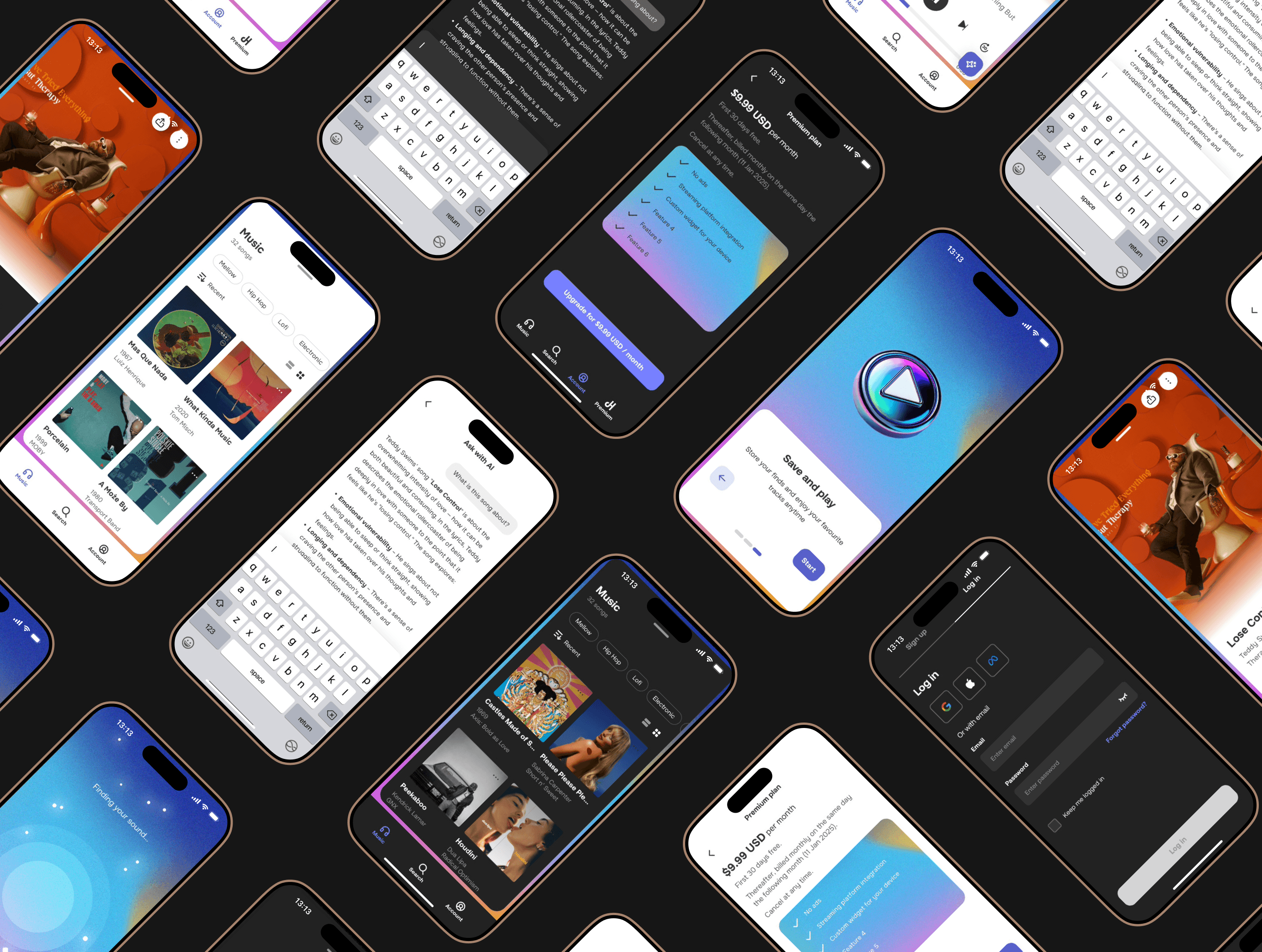
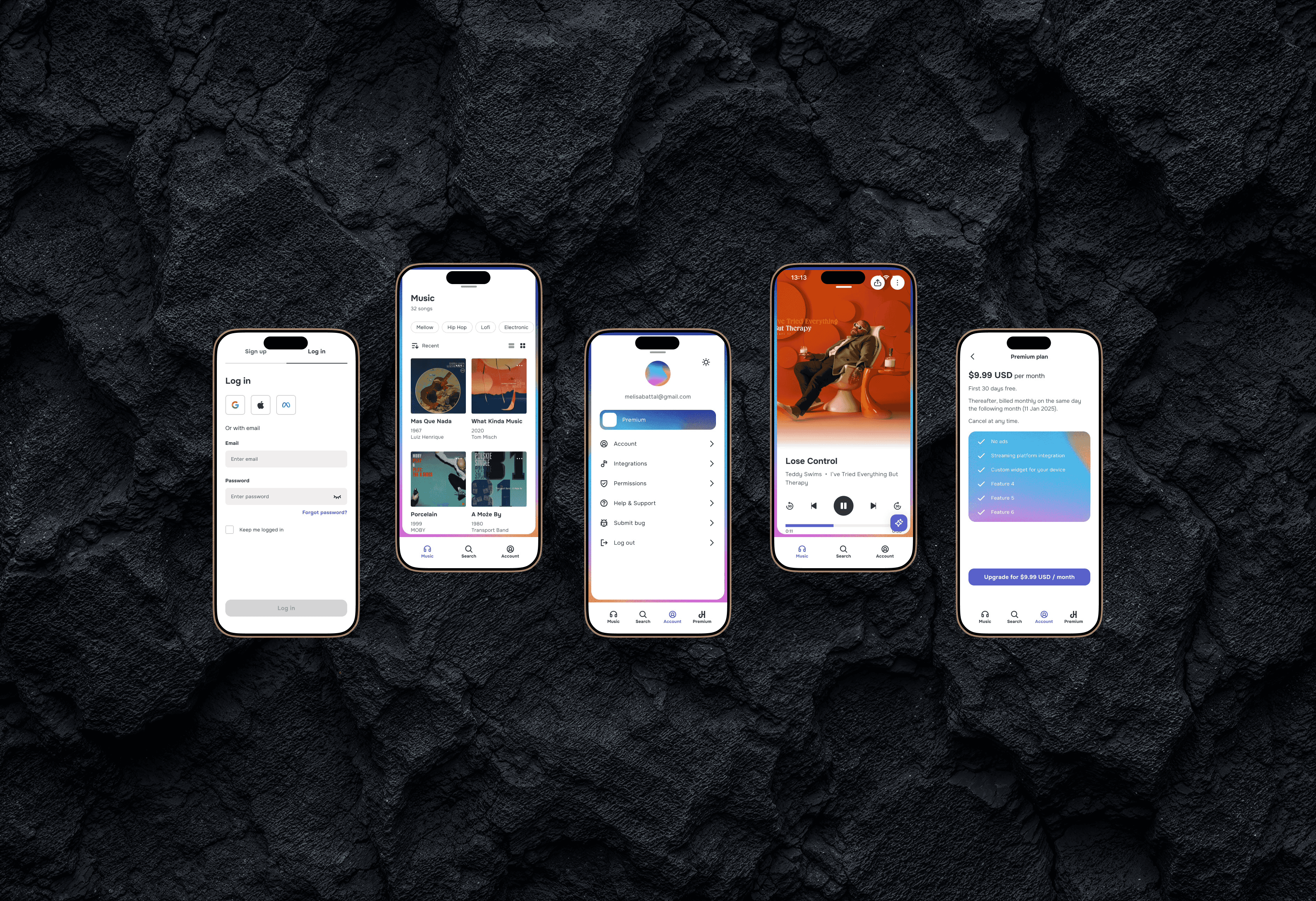
Once the structure felt right after wireframing, I moved into Figma to create the visuals. To keep things manageable, I built reusable components like buttons, tab bars, and menus, so the interface would stay consistent and simple to navigate.
Here’s where I tackled the problem of user frustration with cluttered apps.
Picked a type system that supports quick scanning for song titles and categories.
Designed a clean color palette that guides focus without distraction.
Built consistent, modular components so users never feel lost moving from one section to another.
This system made it easy to layer in AI-driven features, like smart recommendations and mood-based playlists without crowding the interface.
Music Player Experience
Problem Solved: Traditional players clutter the interface with unnecessary controls.
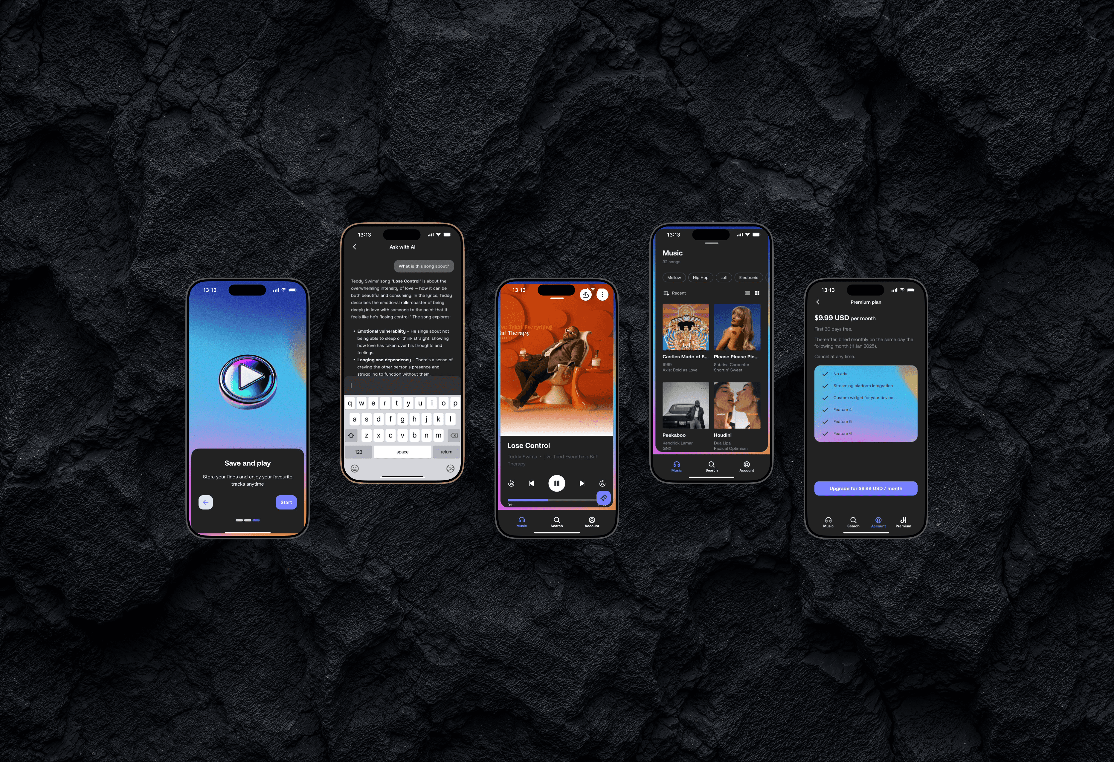
Solution: Designed a minimal, focused player with AI-driven song suggestions below the current track, ensuring both clarity and discovery in one screen.
Light & Dark Mode
To match different user preferences and contexts, Muse supports both light and dark modes. Light mode keeps the interface bright and clear during the day, while dark mode reduces eye strain and feels more immersive at night, giving users control over how they experience the app.
Designing the Flow
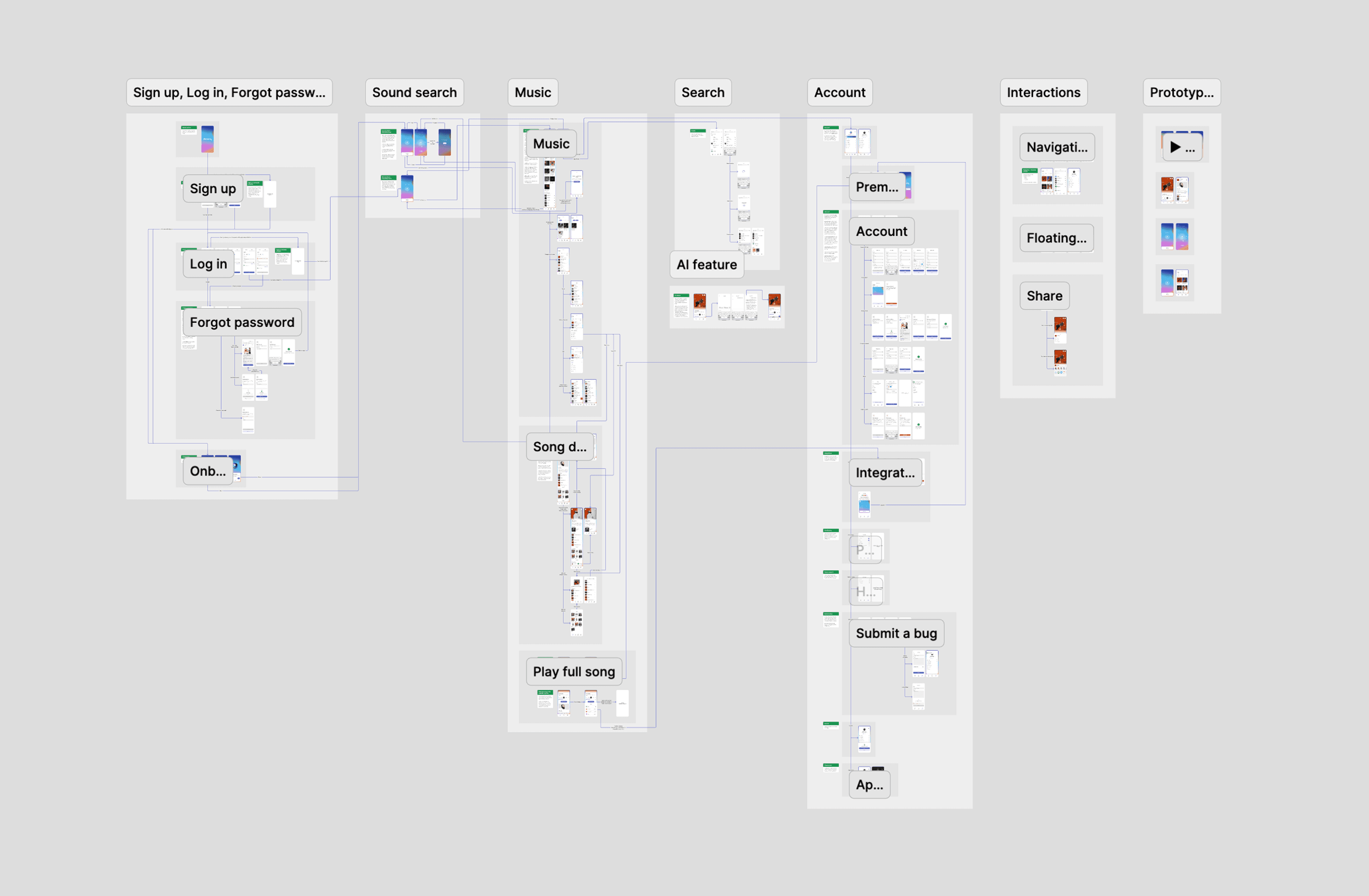
When mapping the flow for Muse, my focus was on simplicity and predictability. I started by sketching the core paths, onboarding, discovering music, playing a track, and upgrading to premium. Each step was tested against one main question: can users get where they want in as few taps as possible, without confusion?
The most important part of UX flow is:
Users always know where they are and what comes next.
Repeating patterns (like navigation and buttons) so nothing feels out of place.
Fewer steps to reach the goal, whether that’s finding a playlist or starting playback.
Competitor Research
Researching competitors wasn’t too hard, everyone knows Spotify, Apple Music, Deezer, Tidal, Pandora, and YouTube Music. The main differences come down to audio quality, supported devices, and price.
For example, Spotify offers wide device support but lower streaming quality. Apple Music has higher-quality audio but is locked to iOS. Deezer charges more but supports FLAC on both iOS and Android.
But here’s the catch: despite these differences, most apps feel the same in daily use. The real gap isn’t in price or audio quality, it’s in the user experience. That’s where Muse comes in: adding a fresh layer with AI-driven personalizationthat cuts down decision fatigue and helps users find music that truly fits the moment.
