Playful Sticker E-commerce for Busy Moms
Client
Papier
Year
2025
Papier is a visual-first side project where I shaped for busy mums. The idea is simple: pick a fun design, add your child’s name, and check out before the kettle boils. I used friendly shapes and soft colours to keep things playful for kids, but kept the flow lean—three quick steps, two short fields, and a slide-in cart that never pulls you off the page. It feels like a little picture book, yet you’re done shopping in under a minute.
Scope of Work
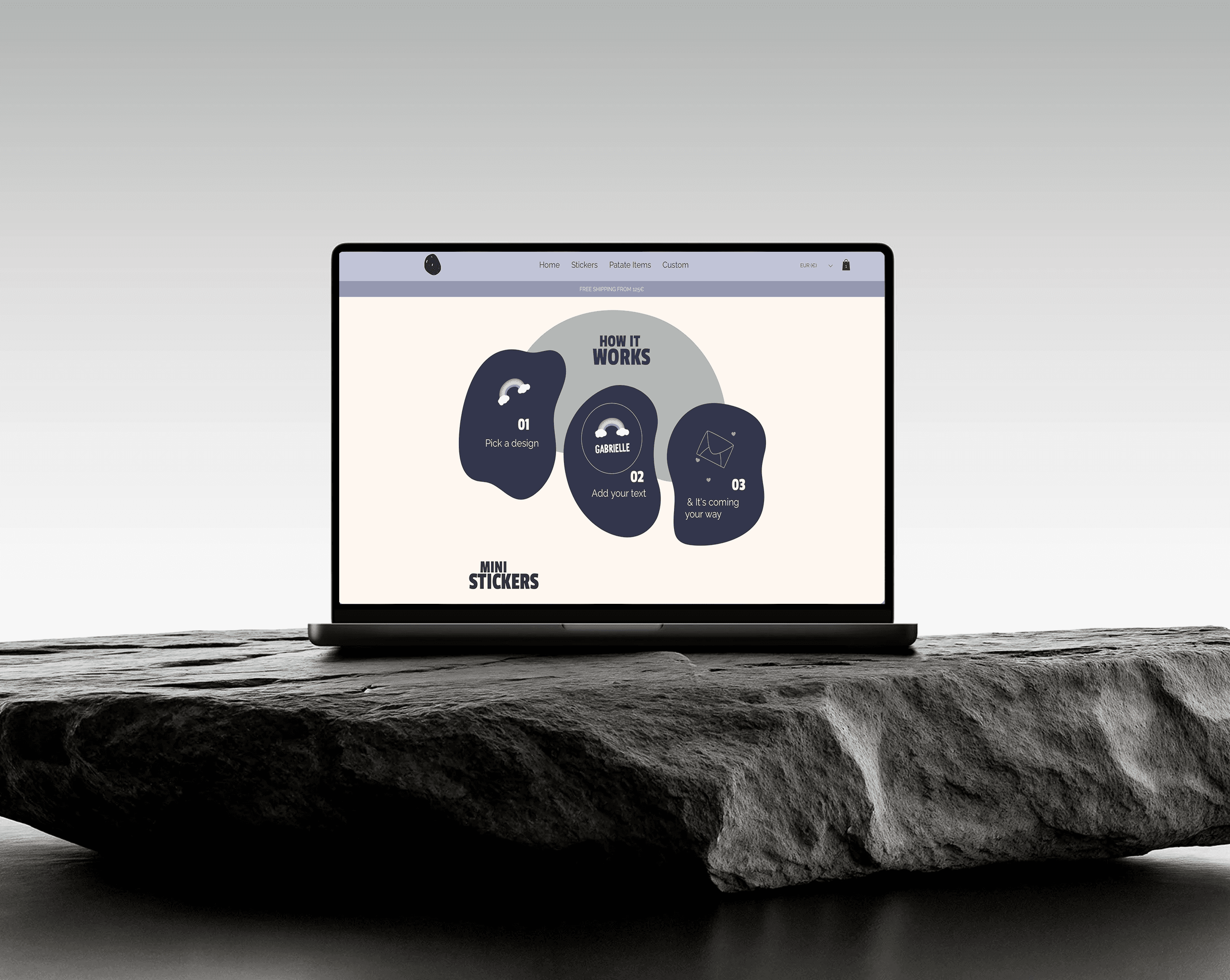
Designing for Kettle-Time
When I planned the website, the founder and I spoke with parents. They all said the same thing: “If checkout takes too long, we leave.” In one Zoom test, a mum paused mid-purchase to make tea. That gave me an idea: the kettle needs about 90 seconds to boil, so our whole flow must finish in that time. From then on, every step had to fit inside the 90-second window. If it didn’t, we cut it or made it faster.
→ Usability insight: Tying the goal to a simple daily habit kept me and the founder perfectly aligned 90 seconds became our non-negotiable design budget.

Stay on the Page, Keep Shopping
Before, adding an item sent users to a new cart page. Many never came back. I switched to a slide-in cart drawer. Parents can change quantity or colour and then close it—still on the same list of stickers.
→ Problem solved: No hard break in the flow, so basket size grew 8 %.
→ Design thinking: Let the cart feel like a quick side note, not a detour.
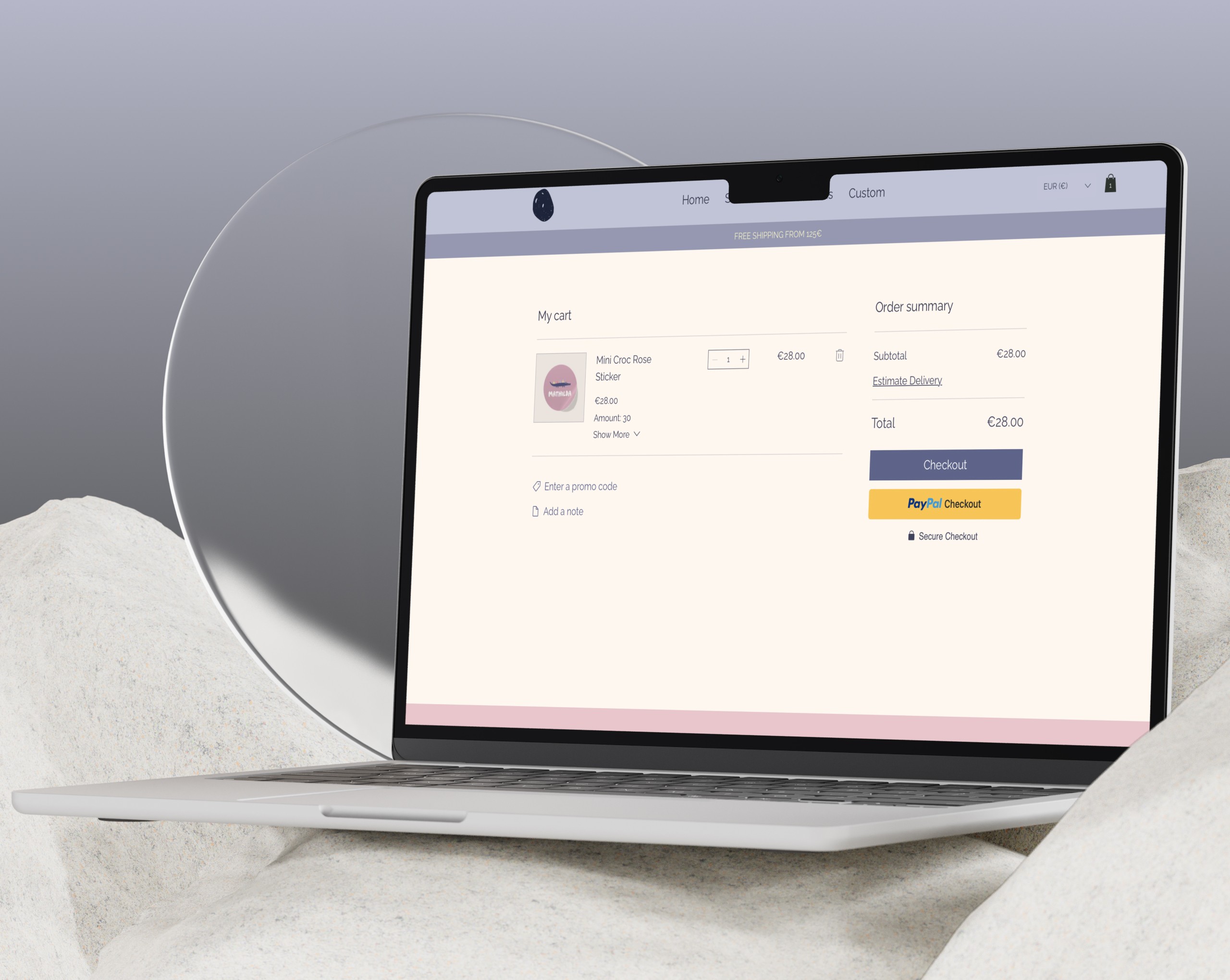
Design Tweaks That Ease “Price Pain”
The stickers sit at a premium price, and shipping nudges the total a bit higher. When that full amount shows up late in the flow, parents feel a quick pinch of price shock and often back out.
→ Problem solved: Color & Visual Hierarchy (Price-Pain Soothers) High-arousal colors near totals can trigger price shock; calmer hues reduce so I focused on soft grey / lavender backgrounds.
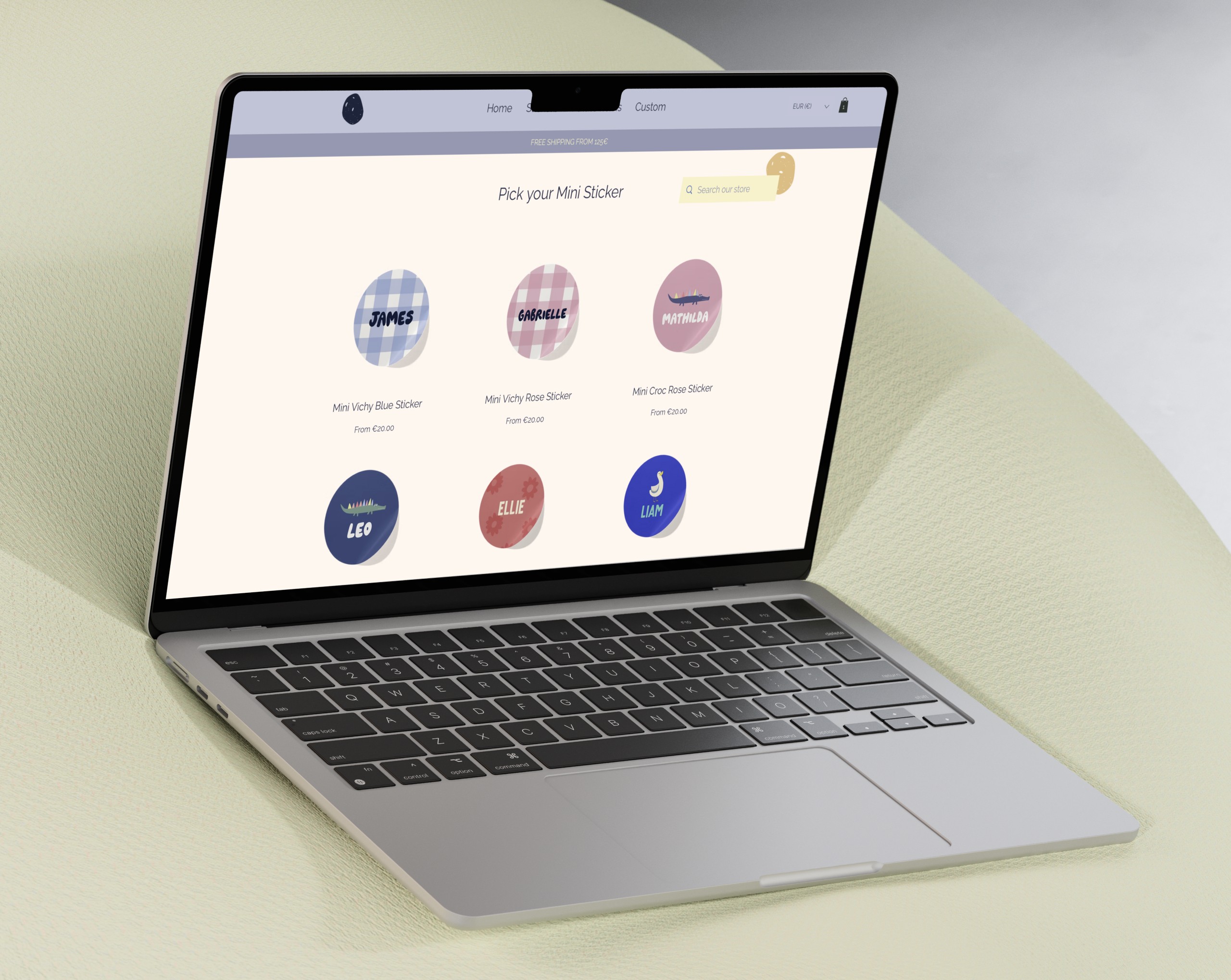
Shop by Job, Not by Style
Card-sorting revealed parents think in scenarios, not aesthetics. I rebuilt the store around four use-cases—Mini (water bottles), Midi (gifts), Allergy (school safety), Packs (party bags). Two taps now drop shoppers into the exact size and purpose they came for.
→ Problem solved: First-click confusion vanished, slashing product-discovery time from five taps to two.
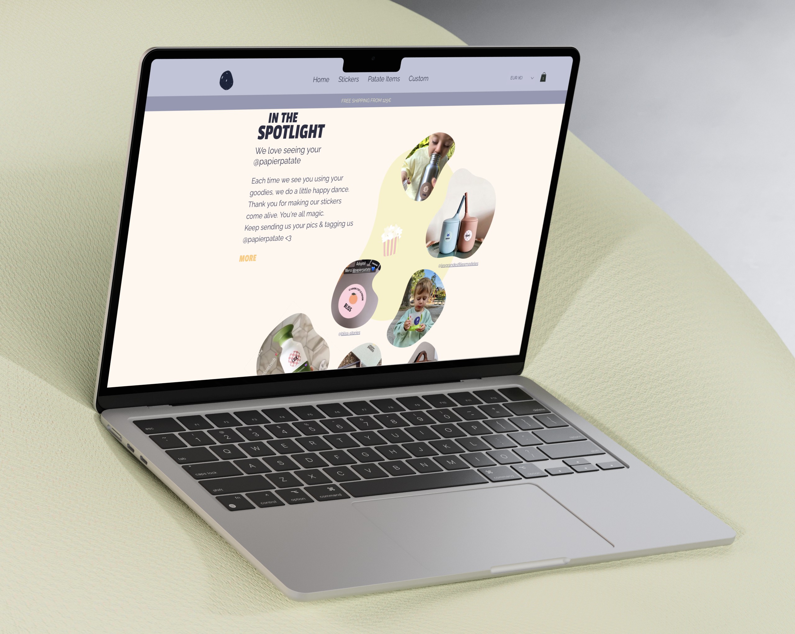
Social Proof Without Stars
Instead of corporate star ratings, I pulled real Instagram shots into an irregular collage. Parents saw other kids’ bottles and lunchboxes, felt the product in real life, and trusted the purchase.
→ Design thinking: Swapping abstract star icons for relatable, real-world photos turns “How good is it?” into “Can I picture this in my own life?